
I’ve always been kind of intrigued by climatology and meteorology. Whenever I read Wikipedia articles about random places, I take special interest in looking at the climate section (if there is one) and seeing the little chart and (hopefully) graph of the temperature and precipitation over the course of the year.
I happen to live in a place with a remarkably mild climate. When I was younger I didn’t think much about it, but as I’ve gotten older and met more people from other places I’ve been more struck by how they perceive it. It can be a real shocker for people to come here in mid-January and find people in shorts and T-shirts and going to the beach and whatnot.
Now, the interesting questions I started thinking about are: what is it that makes a place’s climate seem nice, and how common is it for places to have such a climate? I did some thinking about these questions and just sort of operationalized some of my hunches, and then checked out the implications of this using a fairly big set of global weather data.
What makes a climate nice
The thing that first comes to mind, of course, is temperature. People tend to like places where it’s not too hot and not too cold. You often hear 72 degrees (Fahrenheit) or thereabouts mentioned as a nice, comfortable temperature. Some people have preferences that vary a bit from this — like they like it to be warmer, maybe closer to 80, or perhaps a bit cooler — but in general most people’s ideal comfortable temperature falls within a pretty narrow range. For someone to say their perfect temperature is 90 F or 40 F would be surprising.
But so what is it, temperature-wise, that makes a climate as a whole seem nice? It’s not just a matter of the average temperature, since that doesn’t take into account how much the temperature varies. Two places could have similar average temperatures, but in one case it could be because the temperature doesn’t vary that much, and in another case it could be because it’s sometimes really hot and sometimes really cold.
Now of course you could measure how much the temperature varies using the standard deviation and so forth. However, my theory is that it’s not so much about how much it varies; rather, it’s about how often it gets too extreme. That is, I’m hypothesizing that it’s not that big a deal for most people if it’s frequently a little warm or a little chilly; they just get irritated if it’s ever really hot or really cold. This is just a hunch, and I’m not going to try to prove it here or anything, although it would be interesting to do some kind of survey where you asked people how they liked the temperature on a certain day, and then correlated it with their more general judgments of what the overall climate is like.
But I think the hunch is at least partially validated by how awesome people seem to think Santa Barbara’s climate is. It’s not like Santa Barara is always 72 F. There are days when it’s under 50 or even under 40, and people do this sort of little dance where they’ll either gripe about how cold it is, or chide others for griping about how cold it is because really it’s not that cold in the scheme of things. But the point is, even if no one’s necessarily comfortable when it’s 50 F, the climate is still regarded as awesome because it’s never, say, 20 F. Likewise it might be a bit warm now and then but it’s very rare for it to hit, say, 100 F. So people still think this climate is where it’s at because, even though it might be mildly uncomfortable at times, it’s never extremely uncomfortable.
But the temperature isn’t the whole story. Another key thing, as is often remarked, is the humidity. There are various ways to measure this, but the dew poitn is one straightforward measure that seems to correlate pretty well with people’s comfort levels. Basically the dew point is the temperature at which water will condense out of the air, forming dew. If it’s humid, the dew point will be fairly high — that is, close to the air temperature; if it’s hot but not humid, the dew point will be low.
An extremely low dew point can also be uncomfortable — it can mean the air is excruciatingly dry. However, this seems to be a less important concern for two reasons. First, from what I can glean from internet sources, the dew point has to get really, really low for this to be the case — Wikipedia says -22 F, but of course, [citation needed]. Second (and sort of correlated with this), dew points this low are uncommon unless the temperature is already very low. In other words, if the dew point is uncomfortably low, it doesn’t ruin an otherwise nice day: it means the day was already uncomfortably cold. ((In my data set of 2.8 million daily weather readings, there were only 67 cases where the average dew point for the day was under -20 F but the average temperature was above freezing.))
(The relative humidity is another humidity measure that people often talk about. I did a little poking around and most sources I found seem to suggest that the dew point is a better index of what people subjectively perceive as humidity. In this YouTube video a Milwaukee meteorologist gives a little explanation of the difference between them. He also recommends dew point as the more useful number.)
There are lots of other factors that no doubt affect people’s perceptions of climate goodness. Maybe the next biggest one is precipitation. People seem not to like it when it rains a lot. I think in this case, though, it’s not so easy to define what people actually want. People don’t like rainy days, but in general I think most people would be unhappy in a climate where it actually never rains, because that would mean it’s a desert, and it would probably be hot and not have much vegetation, etc. My guess is that what people want in this department has to do not just with how much rain there is but with how the rain is spread out over the days. It seems that people prefer a situation where it rains hard and is then clear, as opposed to one where it’s just constantly cloudy and rainy, but doesn’t rain very much on any single day.
Another one is wind. People generally like a light breeze, but get irritable when it’s extremely windy.
And no doubt there are others. For the moment I’m focusing on temperature and dew point as two that are easy to describe, easy to find out, and that get you quite a ways towards making a guess at how nice people will think a given climate is. And actually, temperature-wise, I’ll also look at the maximum temperature and the minimum temperature (as opposed to just the average temperature). This is again based on the theory that extremes matter as much as means: if it gets to be really hot during the day, people will likely perceive it as “a hot day”, even if it wasn’t that hot all day long.
My data source
The data that I used come from the National Climatic Data Center at NOAA. I used a dataset called GSOD — Global Summary of the Day. ((http://www.ncdc.noaa.gov/oa/gsod.html)) This dataset contains daily readings from a very large number of weather stations all around the world. Crucially, they include dew point readings. They also have a lot of other stuff, like wind speed, precipitation, etc. (although not all stations report all these different stats). The dataset is giant, so I whittled it down in a couple of ways.
First, I arbitrarily picked a fairly recent year to get data from; I chose 2008. So all the graphs and stuff that follow incorporate only data from 2008. This means they could be skewed if the summer of 2008 was an unusually hot summer in some places, or an unusually cold one in others, etc. It’s basically just a snapshot, not a long-term profile.
Second, I restricted focus to only those weather stations that reported temperature and dew point data for at least 300 of the 366 days. (2008 was a leap year.) There are a ton of stations in the dataset that report only partial data; there are even some that only report data for a single day! I figure it doesn’t make much sense to try to consider data from a station unless it has data on the great majority of days.
Even after the dataset is cut down to size this way, that leaves a substantial amount of data: just shy of 8000 stations. I aggregated all the data from these stations into one big file, stripping out a few kinds of metadata. That file is 181 megabytes and contains just over 2.8 million data points. (One “data point” being one set of readings — including temperature, dew point, etc. — from one station on one day.) ((This is, incidentally, one reason I’m just showing some graphs here instead of presenting the actual data somehow. On my own computer, I put together a little setup where I can interactively explore the data, and it’d be cool to put together some sort of web doodad that would let other people do the same. But I’d either need to get really clever about precomputing stuff, or I’d need to get really clever about optimizing the computations, or I’d need much heavier-duty web hosting than I’ve got. On my computer, even something relatively basic like calculating the mean yearly temperature for all stations takes over 2 minutes.))
Where the good days are
Then I set out to see what implications my notion of “good climate” would have. I decided to pick 32 F as the temperature that is “too cold”, 90 F as the temperature that is “too hot”, and 65 F as the dew point that’s “too humid”. ((Various sources suggest that the “critical” dew point — the point at which people start to perceive the air as uncomfortably humid — is somewhere between 60 and 70 degrees Fahrenheit. See for instance this page that says it’s by some meteorologist, which says 65 is a good cutoff.)) For the temperatures, I went with the max and min temperatures on a given day, rather than the average. (I had to use the average dew point because that’s the only information that the weather stations report.) The upshot of this is that I defined “a good day” to be a day where it never gets below 32 F, it never gets above 90 F, and the average dew point is under 65 F.
 Number of "good days" in 2008 for each of about 8000 weather stations around the world. A "good day" as defined here is a day where the temperature didn't go above 90 F and didn't go below 32 F, and the average dew point was under 65F.
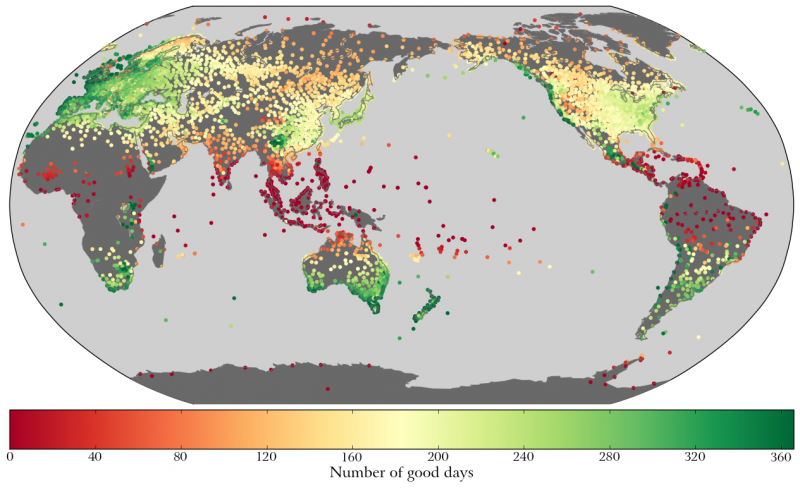
The graphic at left shows what I got. (You can click to get a larger view; note that you need JavaScript enabled to view the images in this post correctly.) This is a map showing the locations of all the weather stations, with each colored according to the number of “good days” that station had during the year. ((The counts are normalized to be out of 366 days; although I only looked at stations that reported for at least 300 days, not all stations reported on every single day.))
I think it’s pretty interesting to look at the distribution of where the dark green dots are. These are the places where almost every day is good — at least insofar as it’s not hot, cold, or humid. As you can see on the map, there aren’t too terribly many of these dots, and they’re clustered in a few areas:
- The west coast of North America, from British Columbia down to around San Diego
- The coast of Chile
- New Zealand and southern Australia
- The southern tip of Africa
- The west coast of Europe, from Portugal up to the Netherlands, and also including Britain and Ireland
- Various scattered highland locations
I wasn’t expecting that last one, but it makes sense. A lot of these places with a lot of “good days” occur in areas where the overall climate is hot and/or humid (near the equator), but where the elevation is high enough that the local climate escapes those regional extremes. You can see distinct pockets of these highland areas where there are green dots surrounded by lots of yellow red ones: in Kenya, a small patch in the southwest Arabian peninsula, southern Africa, southwestern China, the Andes, and central Mexico. You can’t see the elevations on this map, of course, but the climate dataset includes the elevation of each station, and by poking around I found that most of these inland ones were at high altitude.
Some of the other areas also indicate the limitations of my little rule of thumb. England isn’t a place that usually comes to mind when you think “great climate”, but there are a fair number of places there that have a lot of “good days”. This is a case where taking precipitation into account would probably alter things, since it rains quite a bit there. Nonetheless, these high rankings for Britan and even more so for Ireland accurately reflect the Gulf Stream-moderated climate there; the temperature range is moderate compared to inland areas in continental Europe.
The opposite problem arises with some of the locations in southwestern Arabia and in Chile: these places have nice climates temperature-wise and humidity-wise, but are in fact deserts. One of the stations with no “bad days” is called “Desierto de Atacama”. This is the Desierto de Atacama airport near the town of Copiapó, Chile, in, yes, the Atacama Desert — the driest desert in the world. Nonetheless, some stations on the coast of this desert area have what’s apparently called a “mild desert climate”: very dry, but with a fairly narrow temperature range. The same is true of some stations in southwestern Arabic, for instance Sanaa, the capital of Yemen — also not a place anyone immediately thinks of when imagining nice climates.
It’s also interesting that the colors on this map don’t seem to correlate at all with population density. Some of the most densely populated regions in the world — notably northern India and eastern China — are just sort of blah according to this. Within the USA, no place is really that great except the west coast. (This confirms what many have long known: west coast is the best coast. Booyah.) Some of the best-looking areas on this map — Australia and New Zealand — are some of the least densely populated.
Seven places with nice climates
I started wondering about whether the green dots in different areas of the world actually have similar climates. I initially defined good days in the way I did because I wanted to avoid things like misleadng average temperatures. So is it actually the case that these various places with green dots are “good” in the same ways, or are some of them just right under the “too hot” line and others right above the “too cold” line?
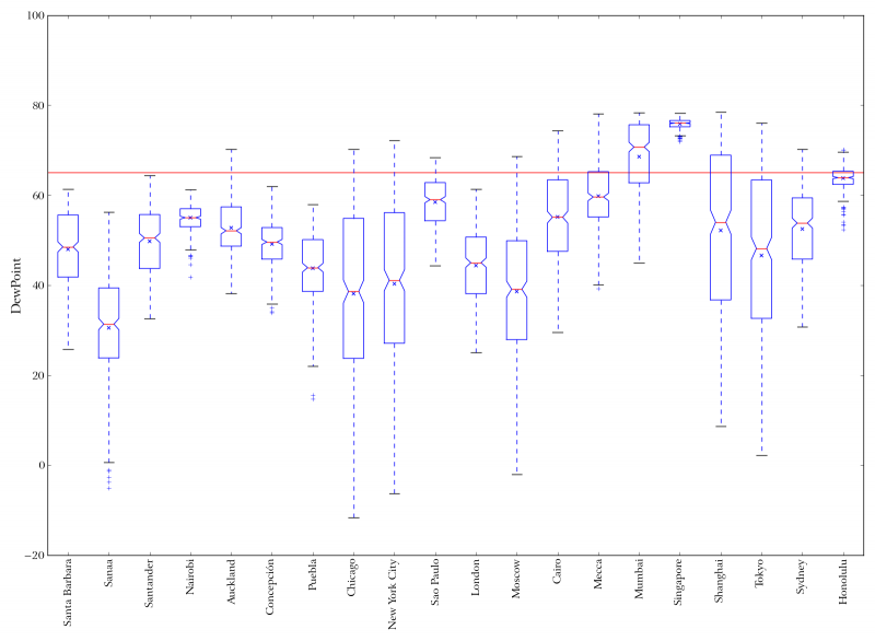
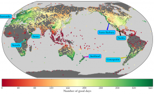 Number of good days in 2008, with example cities labelled.
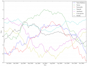 20-day moving average of average daily temperature in 7 example cities with nice climates.
 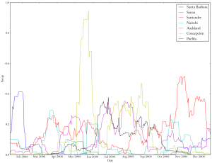 20-day moving average of precipitation in 7 example cities with nice climates.
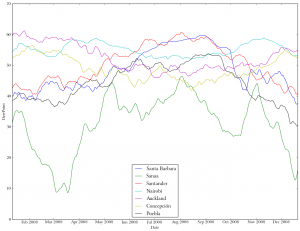 20-day moving average of dew point in 7 example cities with nice climates.


To explore this, I picked seven example cities from seven different “green zones” around the world: Santa Barbara, USA; Sanaa, Yemen; Santander, Spain; Nairobi, Kenya; Auckland, New Zealand; Concepción, Chile; and Puebla, Mexico. Obviously I picked Santa Barbara because that’s where I live. The rest I picked more or less randomly from those cities that ranked better than Santa Barbara in number of good days, although I did pick Santander in preference to other nearby good spots because I visited there a couple years ago.
The little picture frame dealie with the map of these locations also includes other images that are graphs of the average daily temperature, dew point, and precipitation at each of these seven cities. These graphs have been smoothed by using a 20-day moving average rather than just plotting the readings for each individual day. If you hover over the frame you’ll see navigation buttons that let you scroll through the images (you can also click to expand to larger size); this is a nifty JavaScript plugin I found called a “popeye”. ((See the site for the WordPress plugin and the site for the jQuery script that the plugin is based on.))
For the most part, the seven places seem to display similar patterns of temperature throughout the year. (The graphs for Auckland and Concepción are “flipped” with respect to the others because these cities are in the southern hemisphere and have their seasons switched around relative to the other places.) Sanaa gets a bit hotter than the others. Nairobi, which is almost right on the equator, has the most equable climate, with little seasonal variation.
In the dew point and precipitation graphs you can see how the places differ, even though they’re overall “nice” in terms of my definition. Sanaa is the most different, being way drier. It apparently rains a lot in Concepción.
How nice is not-that-nice?
 2008 daily average temperature distribution for each of 20 world cities. Blue line at 32 F (too cold), red line at 90 F (too hot), green line at 72 F (just right).
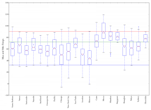 2008 distribution of maximum and minimum daily temperatures for each of 20 world cities.
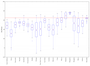 2008 dew point distribution at each of 20 world cities. Red line is at 65 F ("too humid").
 2008 distribution of dew point depression (temperature minus dewpoint) for each of 20 world cities.
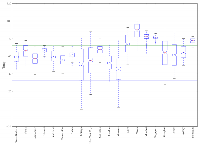

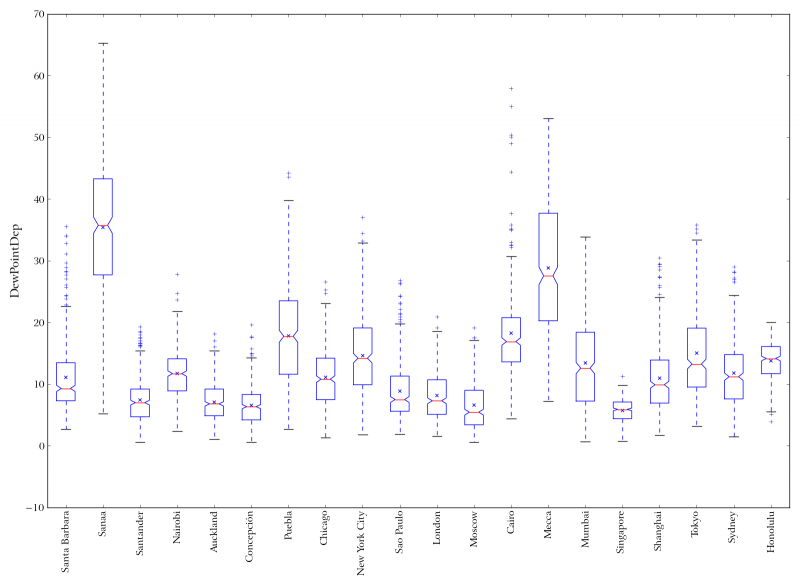
So how do these places compare to other places that aren’t so “nice”? The images in the next popeye show some boxplots of temperature, dew point, and dew point depression for the seven sample cities as well as 13 other well-known cities of the world. The dew point depression is the difference between the temperature and the dew point; higher values are “better” here, because low values mean that the dew point is very close to the air temperature, which means it’s probably humid. For the temperature, there are two graphs. One plots the average daily temperature, and has lines drawn at 32 F (blue), 90 F (red) and 72 F (green). The other plots the combined maximum and minimum temperatures; this thus shows the full range of temperatures experienced by a given place in the year 2008.
You can see from this that the seven “nice climate” places really are noticeably more moderate than most of these other places. It’s interesting to look at Singapore and Honolulu, two places that have extremely uniform climates, with almost no variation in temperature or humidity all year long. Honolulu ranks pretty well in the “good days” measure, but Singapore is too humid. (I’ll come back to this issue of temperature variation later.)
I suppose uniformity in itself might be a desirable feature in a way. If you live in a place where it’s constantly hot and humid, at least you know what to expect every day, and you can wear the same clothes year round and that sort of thing. If you live in a place like Chicago where it gets fairly hot in the summer and bitterly cold in the winter, I guess you have to keep changing your clothes and your mindset.
What makes a climate really sucky
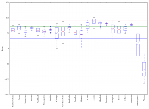 2008 daily average temperature distribution for each of 20 world cities, plus Verkhoyansk, Russia and Vostok Station, Antarctica. Blue line is at 32 F (too cold), red line at 90 F (too hot), green line at 72 F (just right).
 Verkhoyansk, coldest or second-coldest place in the northern hemisphere, depending who you talk to.
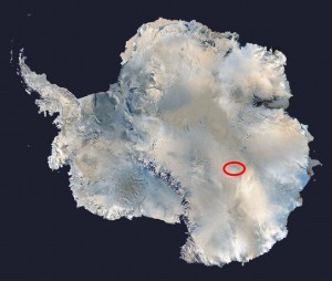 Location of Vostok Station in Antarctica.
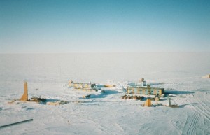 The delightful and appealing situation of Vostok Station, Antarctica, the coldest known place on earth.


Just for fun, I decided to also compare these 20 examples with two of the most undesirable places on Earth to live. The popeye at left starts with the same set of boxplots, with these two delightful spots added. The first one is Verkhoyansk, a town in Siberia which vies for the title of “northern pole of cold” — that is, coldest place in the northern hemisphere. Not only is it among the coldest places on earth, but it actually gets pretty warm in the summer. Check out that boxplot! Average daily temperatures in Verkhoyansk in 2008 ranged from a balmy 79.8 F in the summer to a bone-chilling -66.8 F in the winter. This yearly temperature spread of 146.6 degrees is the largest of any location in my data set.
But at least it’s sometimes warm in Verkhoyansk. The last box on the boxplot shows the temperature range for Vostok Station in Antarctica. This is where the official lowest surface temperature on earth was recorded: -128.6 F. The record high at Vostok is 10 F. In addition to being cold, it’s a desert, with almost totally dry air and almost no precipitation. And it’s at an elevation of over 11,000 feet. And the sun doesn’t rise for 130 days every winter. Wikipedia has this to say about Vostok:
Acclimatization to such conditions can take from a week to two months and is accompanied by headaches, eye twitches, ear pains, nose bleeds, perceived suffocation, sudden rises in blood pressure, loss of sleep, reduced appetite, vomiting, joint and muscle pain, arthritis, and weight loss of 3–5 kg (7-11 lb) (sometimes as high as 12 kg (26 lb)).
Yep, that’s Vostok! The place where the climate is so incredibly harsh that you twitch, vomit, and choke.
Uniform climates are hot
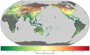 Weather stations color-coded by yearly temperature range (i.e., difference between highest and lowest daily average temperatures).

So Vostok is the coldest, but Verkhoyansk has the largest annual temperature range. In fact, that area of Russia seems to be pretty much the worst in the world in terms of having really huge temperature ranges: all of the top 30 locations with the largest temperature ranges are in Russia, including Oymyakon, Verkhoyansk’s rival for the title of “northern pole of cold”.
Although my “good days” rule of thumb focused on too-hot and too-cold, the overall temperature range is still an interesting thing to look at. The map in the popeye at right shows the weather stations color-coded by temperature range, and you can see the big cluster of red dots in Siberia. Places like this make Chicago and Moscow look like Santa Barbara. (For comparison, the yearly temperature range in Santa Barbara is 30.4 degrees.)
You can see in the map that places near the equator are mostly green, meaning they have a very small annual temperature range. At the equator, there is little difference between winter and summer, because the days don’t really get longer in winter or shorter in summer. However, these places almost all have an annual temperature range that is small, but centered on a relatively high temperature, because it’s hot at the equator.
 Scatter plot of mean temperature against standard deviation of temperature. Color indicates mean dew point.
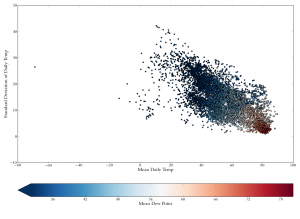 Scatter plot of mean temperature against standard deviation of temperature. Color indicates mean dew point. Vostok Station, Antartica included at far left.
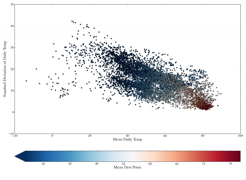
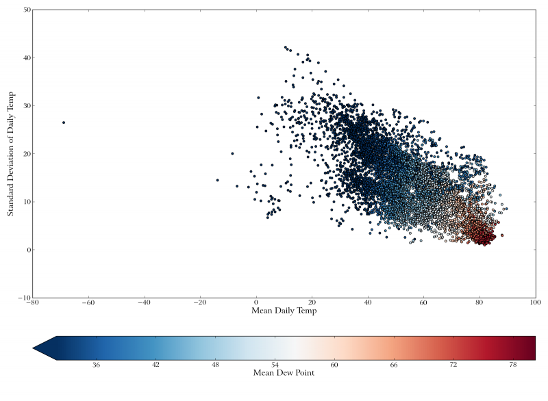
This leads to maybe the most interesting thing I discovered in this little climate exploration. Check out the scatterplot in the popeye at right. This plots the “mean mean” daily temperature (i.e., the yearly average of the average temperatures for each day) of each station against the standard deviation of the daily temperatures. In other words, it compares the average temperature to how much the temperature varies around that average. The points are color-coded according to the annual mean dew point. (Two versions of the scatterplot are shown. To focus attention on the main part of the graph, the first plot excludes Vostok, which is an extreme outlier because of its very very low average temperature. If you want to see how extreme Vostok is, look at the second plot.)
The correlation is quite striking: in general, the narrower the temperature range is, the higher the average temperature is. By looking at the color of the points, you can also see that areas with narrow temperature ranges (and thus higher average temperatures) tend to be more humid. ((These correlations are strong and highly significant, statistically. For correlation of temperature mean and standard deviation, Spearman’s rho is -0.61. For correlation of temperature stdev with mean dew point, Spearman’s rho is -0.73. For correlation of mean temperature with mean dew point, Spearman’s rho is 0.89. In all three cases the p-value shows up as zero, meaning it’s less than about 10-300.)) (Colors that are more than faintly orange would probably be uncomfortably humid.)
Now, if you look at this graph, you can sort of see two main clusters of points. On the left is a big cluster of dots that are mostly bluish. At the bottom right is a small but dense cluster of red dots. And in between, at the very bottom, and right around 70 degrees on the X axis, is a sparse region with not so many points. Some of the points in that region are orange, but a few — not many — are white or bluish dots. These uncommon places are the really, really nice ones: the places where the temperature range is very narrow and centered near 70 F, and it’s not too humid. But, as you can see, there aren’t very many such places. Most of the dots at the bottom of the graph are red or at the right, or both.
I think this graph nicely shows how tough it is to find a really extremely nice climate. Now, of course, you can get more nice places if you expand your range a bit. Santa Barbara has an average yearly temperature of about 60 F (and a standard deviation of 6 degrees), so it’s a little to the left of the sparse region I mentioned above, but obviously it’s still pretty nice here. Still, the overall correlation between temperature, temperature range, and humidity means that there are relatively few places with the right combination of all three factors.
Is that really what makes a nice climate?
Despite having confirmed that Santa Barbara has an unusually nice climate, this makes me want to visit more places and feel what different climates are like. And, even more, it makes me want to get other people’s judgments about what they like in a climate. My “good days” rubric is basically just an operationalization of what I like in a climate, and even then it’s only part of the story. It’d be interesting to ask people from various places how they like it, and why. I think the way I defined it is fairly in line with what a lot of people like, but definitely there’s variation. Some people say they really crave a big difference between seasons, although it’s never clear to me whether they mean a difference in temperature or just a difference in weather. Like, if it could somehow be fairly warm all the time but snow a little in the winter, how would people like that?
I’d be interested in seeing comments from readers on this. Have you been hankering to move to New Zealand? Do you like eight feet of snow on your doorstep every xmas, and think all of what I said is bunk? Do you not feel comfortably warm until it hits 85 F? Voice your concerns.
4 Comments
Splendid! I share your climate curiosity, right down to the “random Wikipedia places” weather-searches. Alas, my success in that quest led me to an unfortunate place to live. I moved to Eureka, California in 2010 and stayed two years. The climate was indeed superb — temperatures vary only 26 degrees from average annual maximum daytime high (64) to average annual minimum nighttime low (40), and the frequent overcast (which, oddly enough, does not produce excess precip) kept the otherwise eye-searing California sun nicely at bay. Well, I loved the weather . . . but so did several thousand alcoholics & drug addicts who flock there from across the lower 48. Seems word gets around, to wit: one can pass out on almost any given day there out-of-doors and not end up dead from exposure. To cater to this lot, marijuana growers have proliferated and are helped greatly by the salubrious climate. So be forewarned by one who should have looked deeper before he leapt. Weather alone does not an Eden make! :-(
Oops — make that 24 degrees, the difference between 40 F and 64 F. Sorry for the typo and poor proofreading.
Hey, glad you liked the post. It’s certainly true that good weather can have its downsides. Los Angeles County supposedly has a homeless population of over 50,000. I still think Eureka’s a pretty cool place, though!
Answering your questions:
perfect temperature is 77F or 24C, well, that is my minimum perfect, max. 30C probably, in the shade.
Other factors beyond temperature are:
number of sunny days
low humidity
clean, not polluted air, neither foggy or humid, just that very thin clear air you get up in the mountains
not windy all the time
a real autumn (that lasts at least 2 months)
some snow new Xmas would be nice
seasonal blooming (not year round)
spring starts early March
only July and half August are higher temperature
LOTS of day light, like the sun goes up at 7 or 8 and it does not go down till 23 or 24, all year round. I know it is physically impossible, but that would be ideal.